Sense and shape

The idea with this page is more as a collection of projects that I either intend to work on or am working on. As the project either get dumped, as many of the inevitably will, or become completed they will change their value on the blog. Projects that I complete could end up becoming a separate part of the blog much like the section on the cuticle.

Friday, 13 June 2014

A while ago I went to Westfields shopping center in Stratford because my fiancee had some bridal things to sort out. I will usually go with her and let her do what she has to do while I try to avoid people as much as I can.  One of my refuges is the Lego strore.

I am usually larger than the average clientel, I don't have to beg someone if I want something and I am pretty sure I am envied but most parents who are in there with their screaming kids. This time around I came upon the small Mixels and bough all nine that make up the series 2. I decided to challenge myself to make some bugs for my shelf at work.


I think I did pretty well and have decided to go ahead and make another 6 bugs (drangonfly, mantispid, moth, beetle, and two other I will have to choose) I will need to get some extra pieces especially for wings. A deluxe brick bucket and some base plates. The bugs below are a wasp, cockroach and a fly. It is definitely the fly that is the best but for a first try I am pretty happy


The wasp

The Cockroach

the fly in a preening posture

Sunday, 8 June 2014

Euglossa

I haven't been on here in ages and suddenly discovered that my cuticle page is going quite well (Cuticle explanation). I actually managed to end up on my own blog because I was writing up a paper on the bizarre cuticle of the larval Liphyra brassolis and was unsure about some of the terminology I used. Because I was looking into starting a new blog, I thought I might as well just keep adding to this old fart.

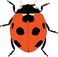
On my last visit to Harvard's Museum of Comparative Zoology (ages ago) I had a small presentation of some of my illustrator drawings. I spent 8 hours drawing up some of the techniques I use by illustrating an Orchid bee. The drawing style is not much different than that presented in for the ladybird (Ladybird), but it is a bit more intricate and I have started using a layer of gradient colours on top of my usual more simplistic three tone shading. The final result after 8 hours is the image below. Since it was for the presentation and not for publication I never gave the image the final touches to the hind leg, the tegula, the eyes and the wing, but it is as done as it will I have time for.


Like all of my drawings they start of from an image or from a series of images if I am redrawing specimens to show multiple facets only certain methods can reveal. I will post some of my larval drawings soon but they will soon be going into press so I will have to wait for them to be published first. If you want to see other stuff I have done check my publications in my in my references page.

Below is a series of images showing my different layers. I am sure any experienced AI (Adobe Illustrator) user can go on and on about layers and how best to arrange them. for me it is as much about making the drawing easier to tackle when I am getting ready to make the images into plates for publications. Simple things like having all your arrows, scale bars and, image numbers and abbreviations on a single layers saves a lot of time. Especially when a reviewer or co-author decides an extra image should be included or somethings should be labelled differently. I also try to consistently have an outline, base, three shadow layers and a gradient layer for every section. Below you can see my different layers, all 14 of them. This is a quick run through and not all steps may be given.


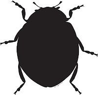
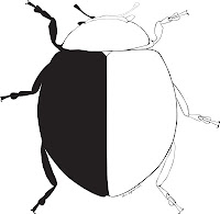
Images 1-2
As you can see in image 1 and 2 the base like in the ladybird is an outline that is then blackened.

Image 3
In image 3 I then include all the individual parts and the gap between these actually become the outlines. I do this because I feel I get better control over line width but I admit this is most likely not necessary anymore because of the line width tool in C6.

Images 4-5
In images 4 and 5 I am adding my typical shadow. I will always minimally use 3 layers and this is almost always the same as the base colour but the blending mode is set to multiply. I like this as the black of the base shines through meaning I don't have to worry about the shadow at the edges.

There is a missing step here where I add two layers of radial gradient shadows. In essence all I do is select the base layer copy and past it to the front and and then make sure the circular gradient reflects where I think the light source comes from. Sometimes I will add multiple radial gradient on top of each other if i find it necessary.  

Image 6
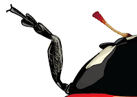
In image 6 I am adding hairs which there are a lot of good tutorials for elsewhere. Basically i make an art pattern brush and individually brush on the hairs where I think they should be.

Images 7-13
I am basically repeating the steps mentioned above on shapes that are on top.

Image 14
The difference is not that big but I have added one big gradient on top of the whole beast so I could get a light difference between the front and rear.

I hope you liked the drawing. if you feel there is anything missing or have any question just add.

I am also, as mentioned earlier hopefully going to start a new page on my Lego escapades. It will mostly be about how I try to incorporate my passion for Lego into my entomological work. Lately I have also started to challenge my self with the mixels Lego series. They are great for making bugs.

Wednesday, 10 October 2012

Scientific habitus in AI (Adobe Illustrator)


I recently did a small workshop with a friend on illustrating habitus (drawings that represent a whole specimen, usually in a predefined view) for scientific work. One thing I hope to achieve by this post is to get some of my drawings and art out of my system. The other reason is that I might end up getting some constructive feedback and learning some new things from eventual comments.

I believe that adobe illustrator is a sandbox tool and almost any given task can be accomplished in several different ways. If the end result is to equal standards it is not a wrong way of doing it. Where the difference lies is in the ease of doing certain tasks. Drawing every single setae (bristle or hair) on a spider leg is not the wrong way of doing it, but making an art brush can significantly improve quality and save time on a drawing.

There are hundreds of good tutorials for illustrator so I will not be introducing the basic tools and short cuts. In general the more you know the program the easier it is to solve many of the problems and challenges you meet along the way.  

The objective of the workshop is to teach show how to make a quick sketch of an animal and how to draw with varying thickness of lines so as not to get a drawing that has a too schematic look but more of a hand drawn style.

My way of drawing is quite straightforward and it is only a matter of how much effort (time) you want to put into it.  The main point in the way I draw is that I am actually not using vectored lines but spaces between shapes create lines. This should become apparent from the description below. I hope you enjoy.

Basic outline

1.     The first step is making a silhouette. The silhouette is the base and what will create the color and lines, including the outline of the drawing.

2.     After the silhouette is done it is filled in with shapes representing the different parts of the drawing. It is here that you are able to define the thickness of the lines ao the distance between the different shapes will decide how much of the dark silhouette shines through.


These two first steps should give you a nice outline where you can now go in and select your line thicknesses. All this however can almost also be done using lines and the line width tool or by making a line drawing into an outline by selecting your path and making it into an outline (Objectà Path à Outline path). I might start experimenting with this but the next steps work best for me when I have the shapes and the silhouette. 

Coloring and shading

3.     Coloring is rather straight forward. I select the different shapes and try to match the a base color of the image with that of my shapes.

4.     As a minimum I always try to use tree shade gradients.  There is also usually no color selection in my shading, unless something actually does change color in its darker form. What I do is I use the same color as my base (or black), but I choose the multiply option in the transparency window and then adjust the transparency if I need a lighter shade. I like this as I feel it gives me a natural transition between the colors. Another reason I use multiply is that multiplied colors do not ad to black and are therefore invisible when overlaid on my outline meaning that I can make shadows that stretch over several different areas of my drawing.

5.    My basic method of creating a shadow is to select the shape/s that I wish to shade, copy (ctrl c) and past in front (ctrl f) in my shadow layer. I then draw the shade on top of my newly pasted shapes and using the pathfinder options I subtract the shadow shape from my base shape. This allows me to get the exact contour of my base shape without having to painstakingly try to follow the base shapes outline.

6.     Highlights are done in the same way as shadows except the color is white and it is not multiplied but simple a transparent shape.


7.     The lady but image is in a rather low resolution which means that the cuticle sculpturing cannot be replicated. The legs however do have some visible setae that could be good to have in the final drawing. To do these I created a art brush remembering to select (Brush scale options à scaling proportionately) and (Colorization à Method à Tint). The setae are then drawn on individually using the brush tool.


Thoughts on my method
As much as I enjoy this way of drawing, mainly because it is fast and I find my results satisfactory I will begin trying to work both with meshes and with importing the paths in to photoshop. If I get around to doing a meshed drawing of this same lady bug I will make another post to show you all my results


Sunday, 5 August 2012

Gephi

Spent a whole day working with Gephi, trying to make a visual representation of my 2012 paper. The idea is to graphically represent the occurrence and position of the references used in a paper. I have a long way to go but the results (see the publication section) are not bad and there is also some analytical element in it that I find quite nice, Have a look..


Sunday, 14 March 2010

Projects

I have a tendency to involve myself in several projects.... right now I am in the process of:

Trying to make a photography cataloging, and 3D reconstruction device for pinned insects.
1). This is hopefully going to be done using photosynth and then exporting the point cloud into maya or another 3D graphics software in order to reconstruct a 3D model of the organism. There will be further details in future posts..
2). Drawing educational diagrams of the different insect orders for morphological terminology and a study leaflet used in a course in field zoology.
3). A small manuscript on the corneal ultra-structures of the insect eye. This article is hopefully also a forerunner to another article about the corneal ultra-structures of the lower Diptera in specific.
4) There is more and it will be coming shortly.